I was hoping to look at my entire lifetime history of Spotify streaming, but I was only able to get a year of historical data in time for this project. I was prepared to annotate more of the lifetime listening in the context of my personal history, but instead I’ve looked at my listening trends for the past year and made an effort to identify from the data particular catalysts. It’s interested to do it this way, because the events from my life aren’t necessarily ones I would have even remembered except for having looked at my streaming history in this way.
The chart below shows all the artists (including podcasts) that I listened to for at least one hour over the past year (Oct 6, 2020, through October 3, 2021). Each tick mark represents one of the times I streamed the artist, the horizontal grey bars illustrating the time from the first through the last stream in that period.
This allows me to easily pick out, for example, the time I found a Dinah Washington vinyl album and must have gone back and streamed her more. I can also very easily see some of my long drives because there are relatively short pockets of podcasting during those times. All listening seems to pick up around the start of September (shaded in light blue), when I moved and I suppose was listening to music more as I unpacked.
I also figured I listened to music more on the weekends but wasn’t sure just how much more, since I also listen while working and throughout the day. Turns out Sunday (which includes Saturday night past midnight), sees my most Spotify streaming:
I was also hoping to write a JavaScript program to automate the looking up of basic information for all my top artists, but I couldn’t figure that out and so just ended up manually adding the gender of each artist I’d listened to for at least an hour over the yearlong period. To do that, I just looked up (if I didn’t know) whether one or more of the artists or podcasters in the group used or was widely described with he/him/his pronouns. Of the 56 artists I’d listened to for more than an hour, 24 used he/him/his pronouns:
While it’s a narrow majority of artists who don’t use he/him/his pronouns, the difference in time spent listening to he/him/his pronoun-users compared to others is much greater, though it did vary over time (you can see from the first chart I did have a Chopin/Satie period):
I was interested in looking at what factors may be driving patterns or cycles of noise complaints, apart from what I took to be the obvious night/day and weekend cycles. In particular, how does engagement with NYC 311 relate to the relative income levels of the complainants’ zip codes? And, do the relative volume of complaints depend on cycles other than the time of day and day of week, such as lunar cycles?
While income and lunar phase may seem unrelated to noise complaints, I’m not sure we have the data to say that noise is related to noise complaints — so why not look at somewhat external outside factors? That is, I’d love to get a decibel meter on every block to see whether the relative levels of volume actually correlate to the number of noise complaints, but the time and budget for this project didn’t allow for that.
There has been a decent amount ofattentiontonoise complaints recently — reportedly a result of our heightened sensitivity to noise as a result of lockdowns and an unexplained uptick of firework availability in the summer of 2020 — and based on this coverage the topic appears to be of interest to a relatively wide audience. As for the moon, I think if there is a connection to be seen between noise and the moon, that will be naturally interesting given the curious nature of that link.
Let’s start with income. NYC has anotoriously wide range of incomes and these divides are well known to correlate to race, immigration status, geography and more. Given the law enforcement component of 311 noise complaints (they are handled by the NYPD), and the NYPD’s well documented racial (and co-relatedly, income) bias, I thought it would be unsurprising, yet worth demonstrating, any links there. For income data, I used US Census Bureau 5-year ACS data for 2019 median income levels by NYC zip code. The 311 data includes zip code but also Community Board and in the future I might re-do this based on CB because they’re somewhat better more neighborhood-intuitive boundaries. I pulled residential noise complaints from the 311 Open Data site going back three years.
The top (blue) of the multiples by median income quintile above shows a very strong negative correlation between the median income of a zip code and the number of noise complaints to have originate there. There are probably several explanations for this, to hypothesize a few:
Housing quality: In higher income neighborhoods, housing quality is generally higher. This affects everything from the thickness and soundproofness of walls, ceilings, and windows, to the density of living quarters, and more. All of these factors can easily impact not only sound, but the likelihood that a neighboring resident will hear enough of it to be bothered.
Gentrification: When higher income individuals move to lower income neighborhoods, they carry expectations for the abovementioned housing quality and are more likely to complain when sound levels don’t match those expectations. Associated racism and biases reinforce these expectations and may result in greater likelihood that a formal complaint is a first rather than a last line of defense.
Green space: Higher income areas are more likely to fall in areas with parks and other green spaces, where parties and other louder events and gatherings may otherwise take place.
In the second mini chart (orange), I looked at the % of complaints that were made via phone as opposed to via the online site or the mobile app, and found a similar, though less striking trend: Generally speaking, the lower income the zip code, the more likely the complaint was made by phone. In higher income areas where broadband internet access is greater, it is likely that complainants favor the online or mobile applications.
The last two charts (red and purple) deal with handling of the complaints. As mentioned, 311 refers all residential noise complaints to the NYPD. Based on the Created Date and Closed Date, I found that the NYPD appears to close noise complaints from the wealthiest zip codes more than twice as quickly as those from other zip codes, though the correlation here is not perfect. While it is true that lower income zip codes have more complaints (and so may therefore take longer to close), this explanation is not fully explanatory, since in the two lowest income quintiles time-to-close is very inconsistent as shown.
It is not only the time to close a complaint that is indicative of how it is handled, however. The 311 dataset lists 13 possible dispositions when it comes to a noise complaint, which I categorized simply as action taken or not, as shown below:
There does not appear to be a strong correlation between the median income of the incident zip code and whether action is taken, although at the extremes there is a notable difference. In combination with the difference in sheer volume of complaints at these extremes, it means that more than 25,000 complaints in the 35 lowest income zip codes during the past three years were acted on, in comparison to only about 2,000 in the 35 highest income zip codes. Unsurprisingly, this inequity appears also both in the rate and absolute numbers of summons and arrests made as a result of noise complaints.
As shown above, while the rate of summons and arrests by the NYPD as a result of residential noise complaints are low, they are not without variability and they show correlations with the median income of the incident zip code, where the highest income zip codes have an average arrest or summons rate of less than half others. Again, taken with the numbers of incidents to which the NYPD responds overall, this means the wealthiest 20% of NYC zip codes accounted for only 5% of all arrests or summons from residential noise complaints in the past three years.
Ok what about the moon?
I used data from NASA’s Scientific Visualization Studio which publishes an annual dataset of the moon phase at every hour. This dataset includes a few markers of the lunar cycle:
Phase: This is expressed in % lit.
Age: This means how many days into the approximately 29.5 day lunar month.
Distance: Unrelated to the lunar month phase, this is the distance between Earth and Moon, which varies since the orbit is not quite circular.
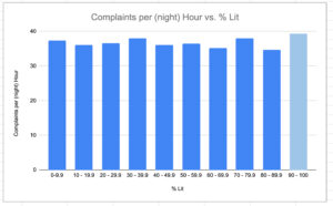
I was surprised to very quickly find that nearly twice as many noise complaints are made when the moon is nearly fully lit (90% or more) or nearly unlit (0-10%). However, looking more closely, I learned that the moon spends more time at the extremes of lightness (I assume because of the way a spherical object is exposed to light, but I’m not a mathematician). (This is generally worth keeping in mind, since if it seems like more crazy things happen under a full moon, that may well be true — but it’s also true that more things happen under a full moon in general because more time passes while the moon is 95-100% lit than, say when it is 45-50% lit.)
I controlled for this fact by looking at noise complaints per hour by moon phase, rather than moon phase alone, basically a metric that would be equal to the “age” metric. In addition, I looked specifically at complaints made during hours I estimated the moon would be visible (noise complaints happen much more often at night anyway). (The 3-year dataset also implicitly controlled for the day of week cycle, though I did double check to be sure.) Once all that was done, the pattern was not nearly as striking — still though, during what we would call a near-full or full moon (90%+) lit, the average number of noise complaints is more than a standard deviation above other times over the past 3 years.
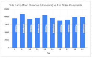
The Earth-Moon distance is also periodic, though the periods have different highs and lows and their timing does not coincide with the phases of the moon (approx. 27.5 days vs 29.5 days). Since the NASA dataset included distance as well, I decided to check that cycle against noise complaints too. What I found interesting and I think deserves a closer look: It seems that at least in the aggregate, there is a cycle of increased noise complaints when the distance between Earth and the moon is between:
10-20,
40-50,
and 80-90 % of its range.
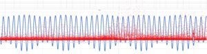
The chart above shows this in the aggregate, but what I wanted but couldn’t figure out how to do in Tableau is to show this actually overtime and to evaluate whether it’s a real cycle in the same way that the day of week is. The best I can do right now is overlaying two scatterplots on Excel, shown below: the blue are overlapping points that show the Earth-Moon distance periods very clearly; the red dots are the total number of residential noise complaints each day for the past three years. The summer peaks, particularly 2020’s, are very clear, and a closer view would reveal the weekend peaks as well. Seeing whether the aggregate Earth-Moon distance cycle shown above is consistent over this period (and whether it’s even statistically significant in the aggregate) requires follow-up work…
I know next to zero formal statistics, but for fun I did assign the same data to a random set of 10 numbers and then aggregated the number of complaints by those randomly generated categories. The variance in the Earth-Moon data is about twice as much as the variance in the randomized set, so, maybe that’s something?…
Need help with the Commons?
Email us at [email protected] so we can respond to your questions and requests. Please email from your CUNY email address if possible. Or visit our help site for more information:

 I know next to zero formal statistics, but for fun I did assign the same data to a random set of 10 numbers and then aggregated the number of complaints by those randomly generated categories. The variance in the Earth-Moon data is about twice as much as the variance in the randomized set, so, maybe that’s something?…